
Interior design achieves its most powerful effect when it touches emotion before explanation. A room can glow with personality even in silence. That quality rarely depends on square footage or cost. Texture holds the key.
A tactile story unfolds across every inviting home. Texture lives in a velvet pillow, a linen curtain, a brushed oak table, or a rough-faced brick wall. Each material speaks with its own temperature, weight, and presence.
Combined with care, they shape warmth not as decoration but as atmosphere.
Designers who think in texture often work with instinct before theory. They build comfort into corners and stretch mood across walls. The effect emerges slowly. No single surface carries the scene. It takes contrast. It takes repetition. It takes the will to let a room breathe its own rhythm.
This guide offers tools and inspiration for crafting spaces that pull you in—not with objects but with feeling.
Thin Brick: Foundation of Texture
Thin brick sets an interior apart with quiet strength. It introduces history, depth, and grounding—all in under an inch of material. Every surface it touches gains gravity.
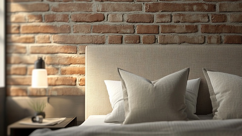
Where to Use It
Use behind a headboard, around a fireplace, or as the only textured wall in a small dining space. Thin brick works in entryways, hallways, or mudrooms that need identity without decoration. Kitchen backsplashes or island bases also gain tone and story without weight.
Color and Finish Tips
Warmer reds feel traditional. Pale clay softens daylight. Charcoal or deep brown gives sharper contrast. Pair with a natural grout tone for age or white grout for clarity. Avoid glossy coatings. Let light touch the raw surface.
Pair With
- Oak, walnut, or unfinished wood
- Linen, boucle, or cotton
- Aged brass, matte black, or oxidized steel
- Jute rugs, wool throws, or woven stools
Keep shapes grounded and lines soft. Avoid plastic or polished metal near brick. Let contrast feel intentional.
If you are looking for quality and impressive design, there are some great options you can find here.
Layered Textiles: Softness with Structure
Textiles do not sit in a room. They shape how it feels. Layers of fabric pull space inward, absorb sound, soften light, and offer rest. The right fabric, in the right spot, changes silence into comfort.
What to Layer
- Cushions: Use different sizes, weights, and weaves
- Throws: Choose visible texture—knit, fringe, or waffle
- Curtains: Avoid shine; aim for drape, not stiffness
- Rugs: Anchor each zone with pile height or woven density
Combine smooth with coarse. Balance cool linen with dense wool. Use weight to suggest use. Heavy curtains in a bedroom. Lighter cotton near sunlight.
Placement Strategy
Let layers serve function first. Cushion depth at the sitting spot. A rug underfoot near every exit. Softness where light hits directly. Double curtains—one sheer, one opaque—offer range without clutter.
Stick to one dominant texture per view. Surround it with contrast, not competition.
Suggested Palettes
- Oatmeal, clay, moss, and ochre for warm base tones
- Rust or charcoal as accent
- Avoid pure white or black unless contrast is deliberate
Natural Wood: Quiet Warmth That Ages Well
Wood never feels artificial. Even when processed, it keeps the record of its origin. Every knot and grain offers quiet pattern. Unlike painted surfaces, wood evolves.

Use with Purpose
A single statement piece works best. Choose one:
- A large dining table with visible grain
- A bench in the hallway
- Exposed ceiling beams
- Floating shelves cut from one slab
Avoid crowding. Let the wood breathe.
Tone and Grain
Pale oak adds calm. Rich walnut gives mood. Ash or maple reads clean. Avoid orange-tinted finishes. They fight natural light. Choose matte or oil-sealed finishes for quiet depth.
Use grain direction to guide the eye. Horizontal for calm. Vertical to stretch height.
Match or Contrast?
- Match: Pale oak table, pale wood chairs, light floors
- Contrast: Dark walnut table on pale woven rug, black chairs
- Mixed: Same tone, different wood types
Keep one constant—either tone or texture—not both.
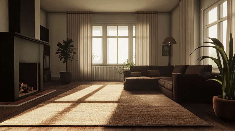
Lighting: Texture Through Shadow
Texture depends on light. Even the richest surface fades without it. Lighting brings out grain, weave, edge, and depth. To shape warmth, control direction, tone, and scale.
Layer by Type
- Ambient: General overhead glow—avoid harsh white, favor warm diffusion
- Task: Lamps at work spots—brass, wood, or ceramic bases ground the look
- Accent: Wall washers, picture lights, uplights to sculpt texture
Never rely on a single source. Let each space hold at least two.
Direction Creates Texture
Downlight flattens. Side light reveals. Backlight silhouettes. Use adjustable sconces near brick or wood. Let a floor lamp skim across a boucle sofa. Hang pendants to graze a linen curtain.
Think of light as a tool, not an accessory.
Shade and Material
Choose natural shades—linen, parchment, rattan. Opaque materials give more shape to the light. Clear glass spreads it wide but loses intimacy. Avoid metal that shines. Use metal that holds patina.
Bulbs matter. Avoid pure white. Aim for warmth under 3000K. Frosted bulbs soften edges.
Zones to Highlight
- Behind the couch
- Inside a bookshelf
- Corners with no furniture
- Over a textured wall
Finishing Touches: Quiet Details That Complete the Room
Texture works best when supported by restraint. Once major materials settle into place—brick, fabric, wood, light—the smaller elements carry tone and rhythm. They refine the mood. They hold space together without force.
Vary Scale Without Noise
Use texture in small and large doses. A single oversized woven basket. A petite clay dish on a raw shelf. A ceramic vase with matte glaze. Let one detail catch the eye while others support.
Place rough next to smooth. A soft sheepskin draped over a leather chair. A heavy linen napkin on a polished table. Friction creates memory.
Avoid Overlayering
Leave negative space. Not every surface must speak. Let wood sit bare. Let a wall breathe. Overfilled rooms cancel their own warmth.
Choose three dominant textures per space. One grounding. One soft. One reflective or transitional. Edit often.
Natural Additions
Use branches, dried florals, or a single live plant with visible texture—fig leaves, olive stems, or thick moss. Let organic elements mark the seasons. Swap in pine, wheat, or stone as tone shifts.
No plastic. No synthetic fillers. Let each material bring its own weight.
Scent and Sound
Warmth does not end at touch. A room speaks through scent and sound. Use candles in earthenware. Diffuse essential oils near natural materials. Avoid sharp notes. Sandalwood, amber, vetiver work quietly.
Texture as Memory, Not Decoration
A warm home speaks through touch before style. No object alone carries the mood. The feeling builds through contrast, restraint, and patience. Texture invites presence. It does not perform.
Thin brick marks the foundation. Textiles soften its weight. Wood holds the room in balance. Light gives shape to silence. Finishing touches—the right plant, a hand-thrown bowl, the scent of aged resin—complete the experience without noise.
Design in layers, not themes. Think in surface and shadow. Let each material offer its own voice without needing harmony. A home shaped by texture does not follow trend. It holds story.